Logo
The logo is done with embedded name and tagline. Use with tagline whenever possible, unless the logo needs to be smaller than 100 px wide, in which case the tagline begins to get too small to read. The logo without the tagline may be better for more graphics-rich design integration, and for smaller spaces. Here are some logo variations in various sizes.
- 350 x 350
- 350 x 350 on a transparent background. no white around the logo. only use this when creating graphics and you need a logo to go over a background that is not white.
- 200 x 200
- 100 x 100
- 50 x 50
- 40 x 40
- 16 x 16
Here are some vector-based versions of the logo for a scaling up, larger versions, working with designers, etc.
Typeface
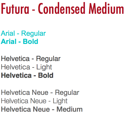
Our default font for body text is Arial, Helvetica, and Helvetica Neue. For headings of any sort use Futura in Condensed Medium.
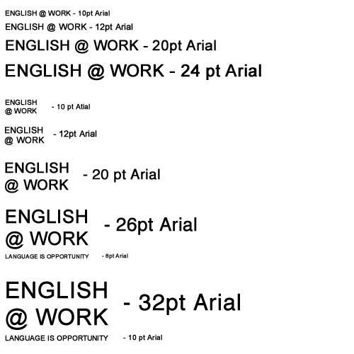
You can write it all out on one line, or stack it on two. If you stack it, you can fit the tagline beneath it, same width, but this necessitates the name being written in at least 26pt font to make the tagline readable at 8pts.
Templates
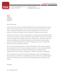
Letterhead – .doc
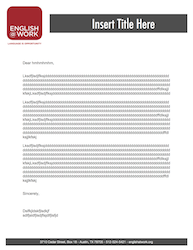
Document Template – .doc
There are .pages versions of these documents as well, however, WordPress does not allow for those type of files to be uploaded. If you need those versions, they live in Dropbox under Systems and then Blank Forms.
PowerPoint Template – .pptx
The PowerPoint uploaded above was used for a supervisor orientation at Barton Creek Resort & Spa. If you need a PowerPoint for a volunteer or class info session, do not worry! Use this PowerPoint and change up the information. Remember to keep all headers in Futura – Condensed Medium and body text in either Arial, Helvetica, or Helvetica Neue.
Another thing to keep in mind: Keep your presentations clean, easy to read (don’t use tiny font), and simple. Also, no life stories on single slides. Get to the point. 😉
Colors
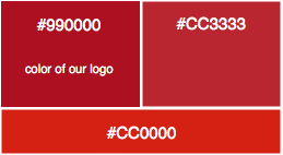
Logo red is HEX #990000. Sometimes this color will change slightly when the logo is uploaded somewhere or onto something. If this happens, I’ve found that the red changes either to #CC3333 or #CC0000. Because of this, please try and use the highest res logo you are able and allowed to when uploading. It decreases the chances of the red in the logo from being distorted.
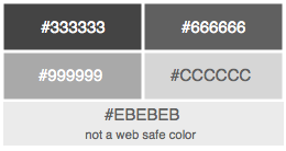
These are the variations of grey used on the website and any of our marketing materials. The #666666 grey is the standard and what you’ll see in all our marketing documents and body text.
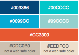
The colors below are what we have used as complimentary colors in marketing materials. The #00CCCC tealish color has been the most widely used complimentary color.
Email Signatures
Below is what an E@W email signature should look like.
Name
Your Position Title
ENGLISH @ WORK
insertyouremail@englishatwork.org
O: 512.524.5421 | C. insert your number here
3710 Cedar Street, Suite insert # here | Austin, TX 78705
Blog | Twitter | Facebook
You can edit your email signature by going to the gear icon near the top right corner of your email window. Click on that and then click on Settings. On that page and in the general tab, scroll to the bottom and you should see the signature edit box. Make sure ENGLISH @ WORK (http://www.englishatwork.org), Blog (http://www.englishatwork.org), Twitter (http://www.twitter.com/englishatwork), and Facebook (http://www.facebook.com/englishatwork) are all hyperlinked.


